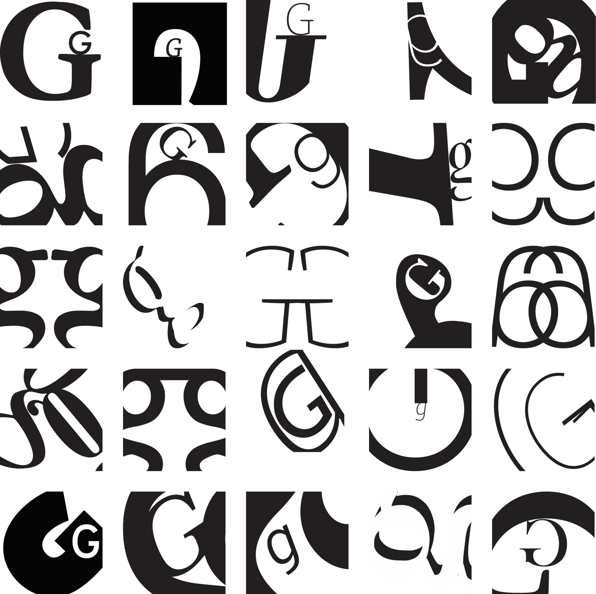
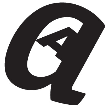
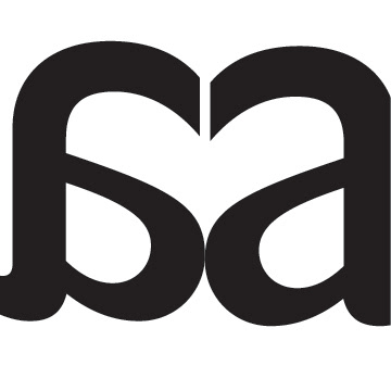
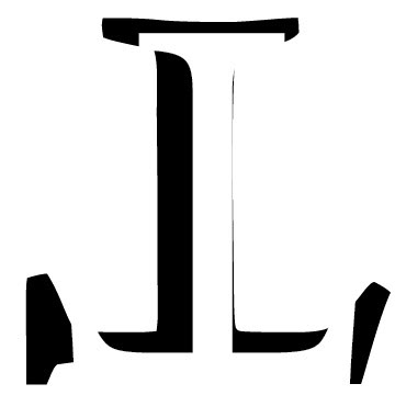
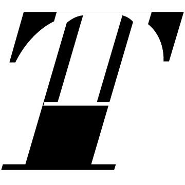
Letterforms
This project was focused on creating letterform pairings. It was my first project during my Spring 2021 semester. I greatly enjoyed working on this as it challenged me greatly and made me think outside of the box to and think abstractly about how each letter pairing. It makes a big difference what font, size, and orientation each letter is in and the shapes they transform into. I found that curly fonts worked best for making a form of looping tunnel formation or spotlight as this image of two G's creates whereas linear fonts led to more geometric designs.
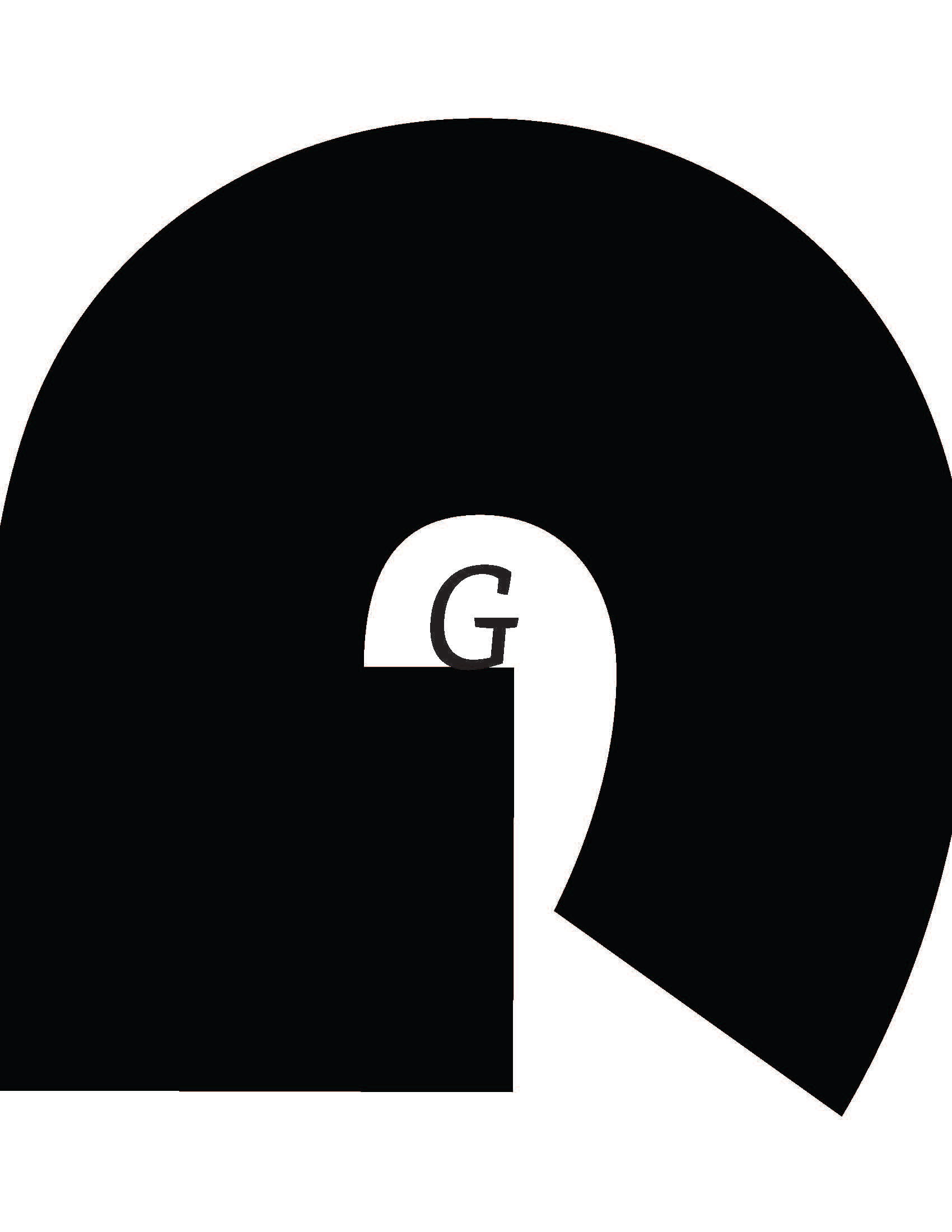
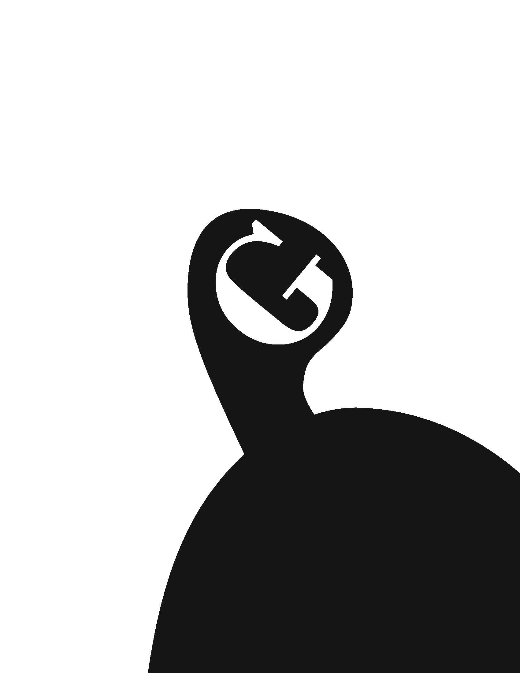
These two display how simple an idea can be while still working elegantly. using one letter to frame the other makes a big difference.