Rebrand
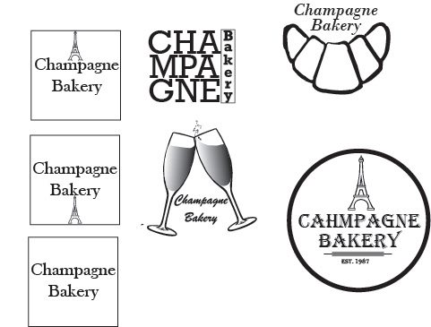
Rebranding for Champagne Bakery was a wonderful time. The project came out well in the end and I am very happy with the design choices I finalized. At the beginning of the project I was at a loss for where to go without being cliché and found it hard to avoid the obvious tropes of French bakery logos such as Eiffel Towers. It wasn't until I rethought the project and focused more on the roots of the brand that I settled on having kitchen tools within the logo and a simple cupcake. This brand desperately deserved a redesign and I am extremely happy that I was able to make something work. This was easily the most challenging project to date and made me feel like I was in the real world working for and corresponding with a brand.
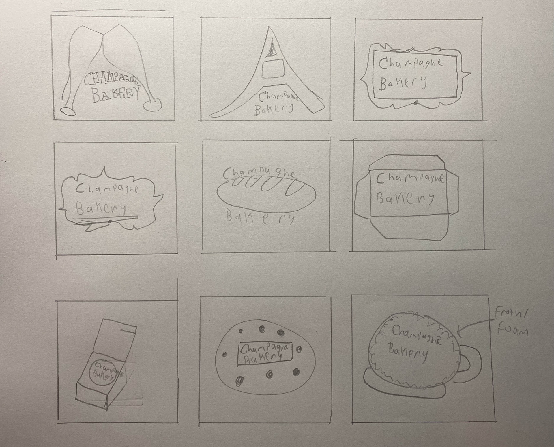
Below are some early explorations into possible designs. These, as stated above, were a bit amateurish and were necessary to achieve my final logo.
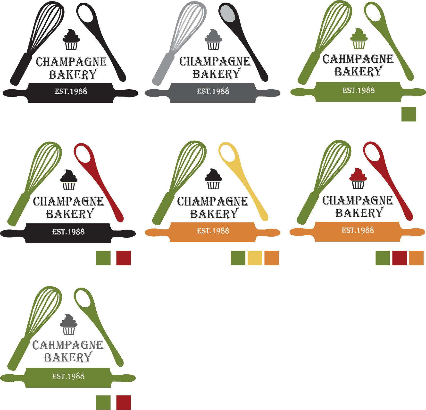
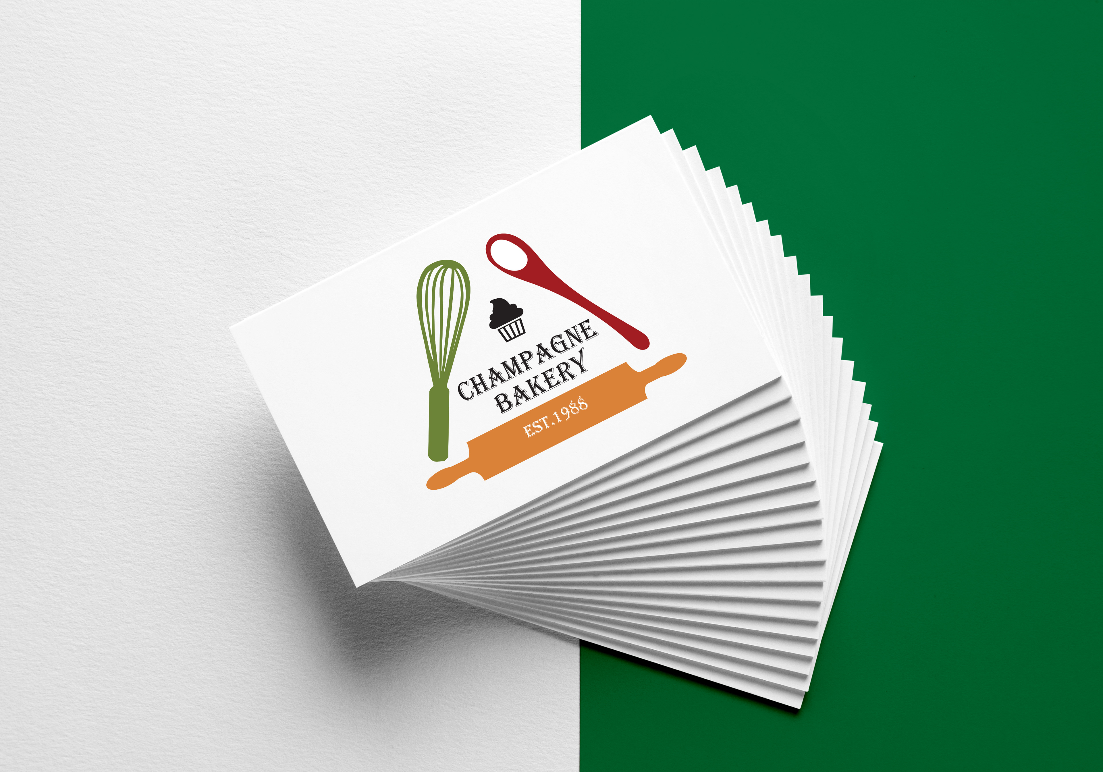
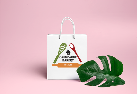
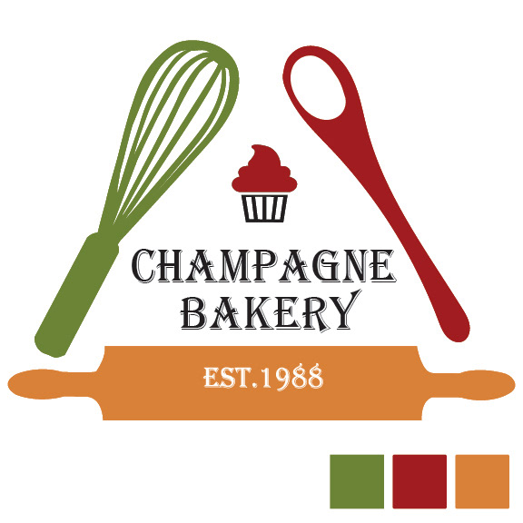
Above are the color explorations as well the black on white and grayscale versions of my logo. Below is the final logo
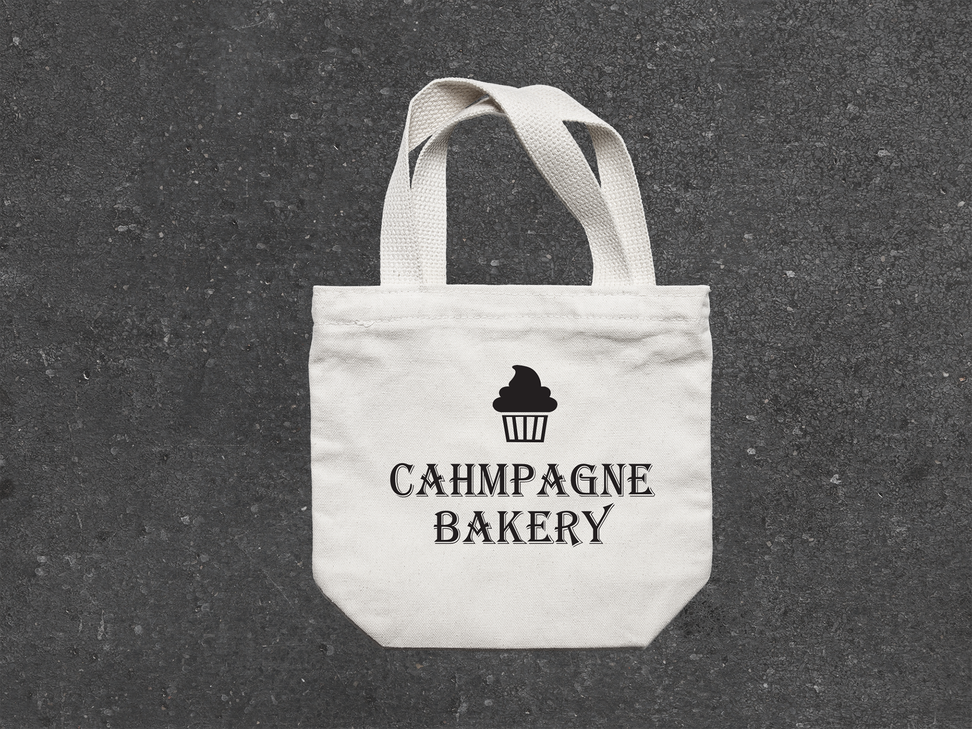
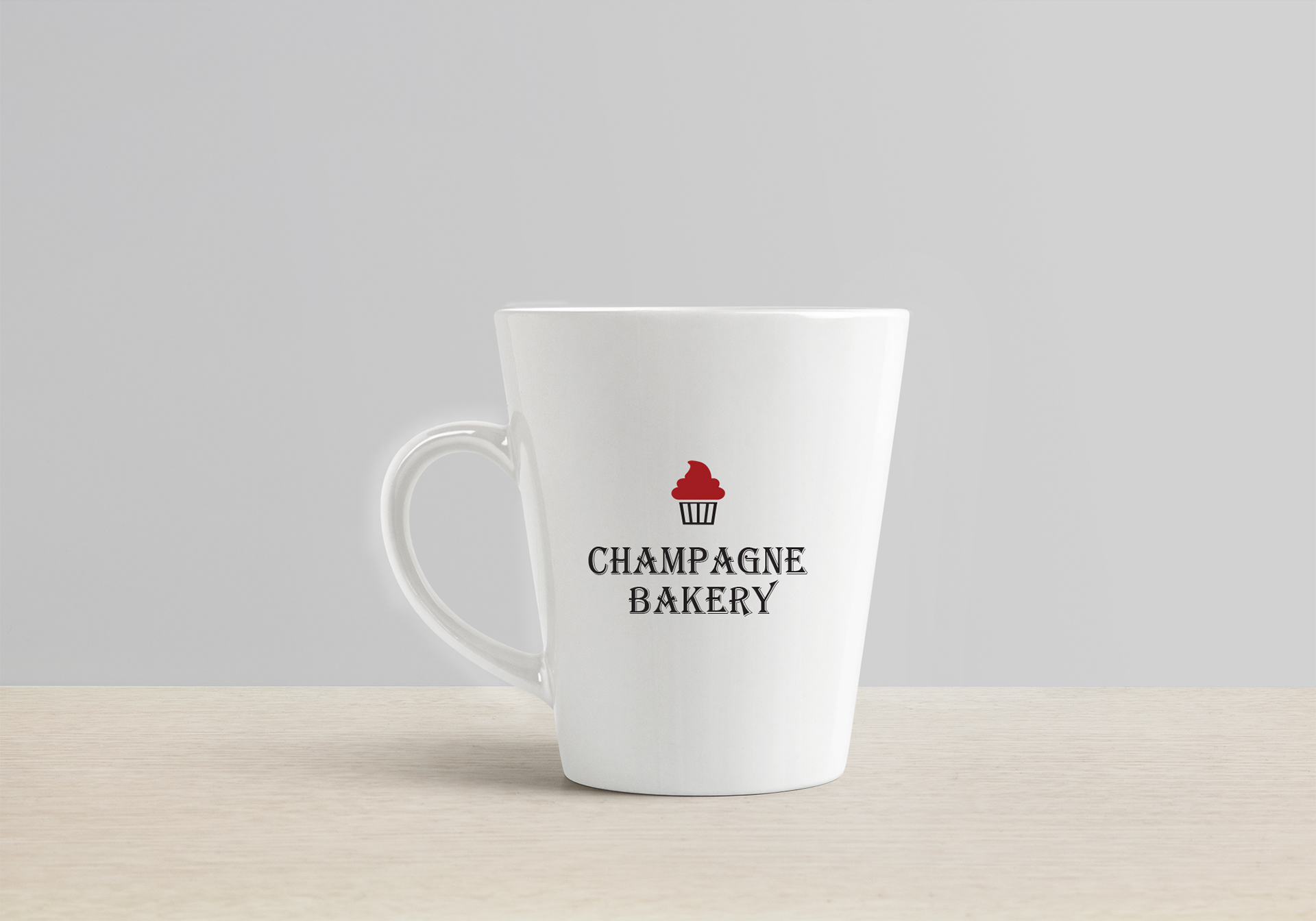
Finally, these are some products that feature the redesigned logo.